4 Pics 1 Song: UI/UX Re-design
Role: Senior UI Artist
Skills: Creative Research, Concept, UI Design, Icon Design, UX, Layout, Communication
Tools: Adobe Illustrator, Photoshop, Unity Game Engine, NGUI plugin, Perforce
Skills: Creative Research, Concept, UI Design, Icon Design, UX, Layout, Communication
Tools: Adobe Illustrator, Photoshop, Unity Game Engine, NGUI plugin, Perforce
Splash Screen I Designed
|
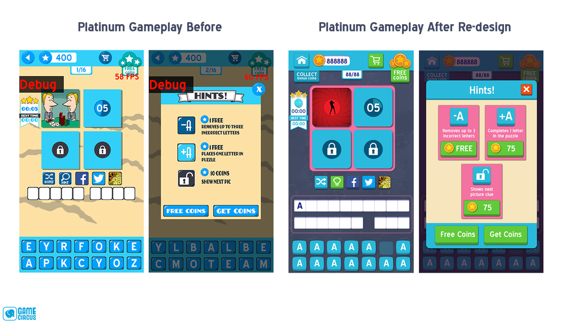
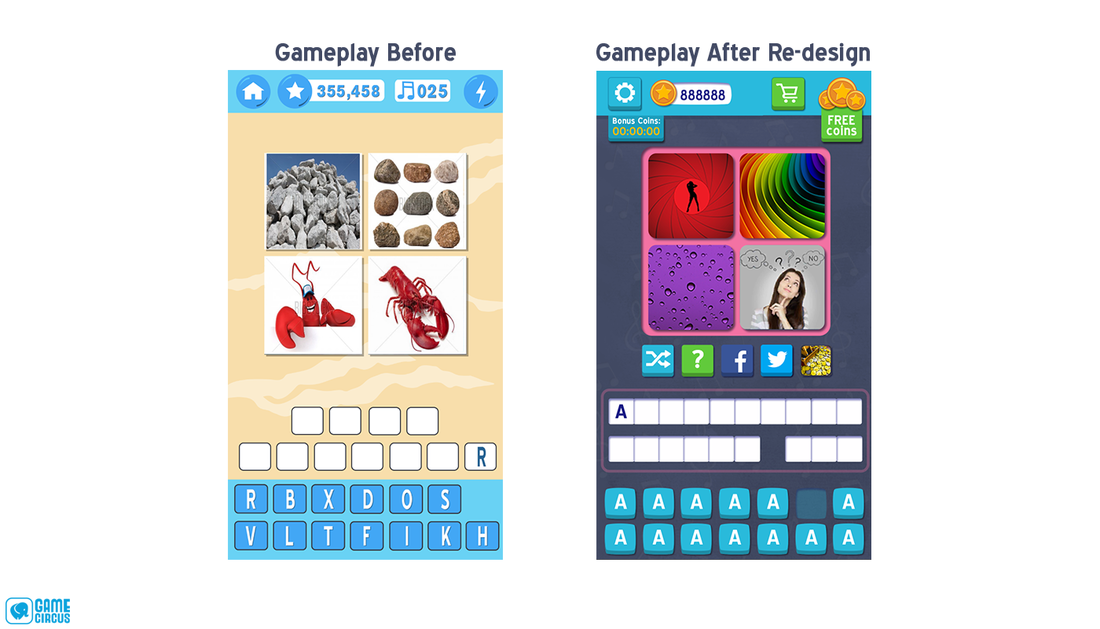
For 4 Pics 1 Song, I re-designed the UI based off of one of the legacy hero screenshots. The request was to bring the game's vintage art style to something more modern. While I mostly went with the flat UI graphic trend at the time, I made sure to give a visual difference to the tactile buttons and tiles needed for a "word" game. In addition to the visual changes, I worked with the Lead Game Designer to update some UX conventions as well. |
Gameplay
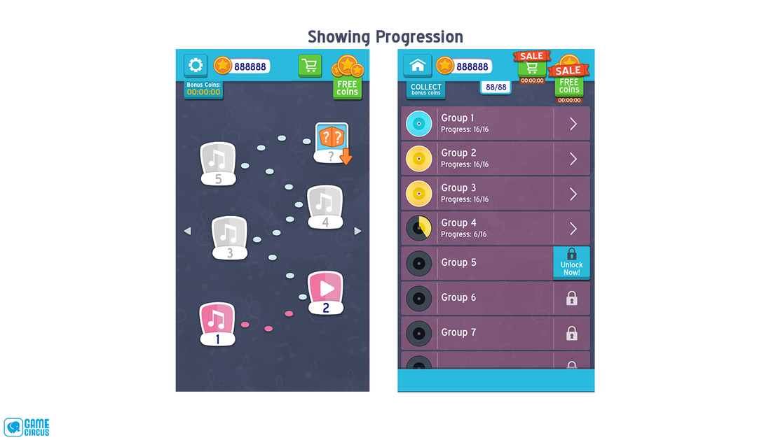
One of the UX changes we made was progression. We did an A/B test on a Map Progression and a List Progression.
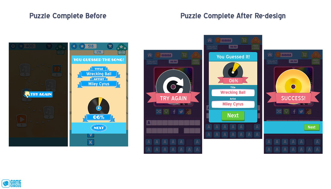
One of the biggest additions to the re-design was the addition of the Success screen. The original flow didn't really celebrate completing an "album." I also updated the visual hierarchy of the Puzzle Complete screen, making progress the most important factor, and made the next button more noticeable and more button-like.
Shop & Monetization
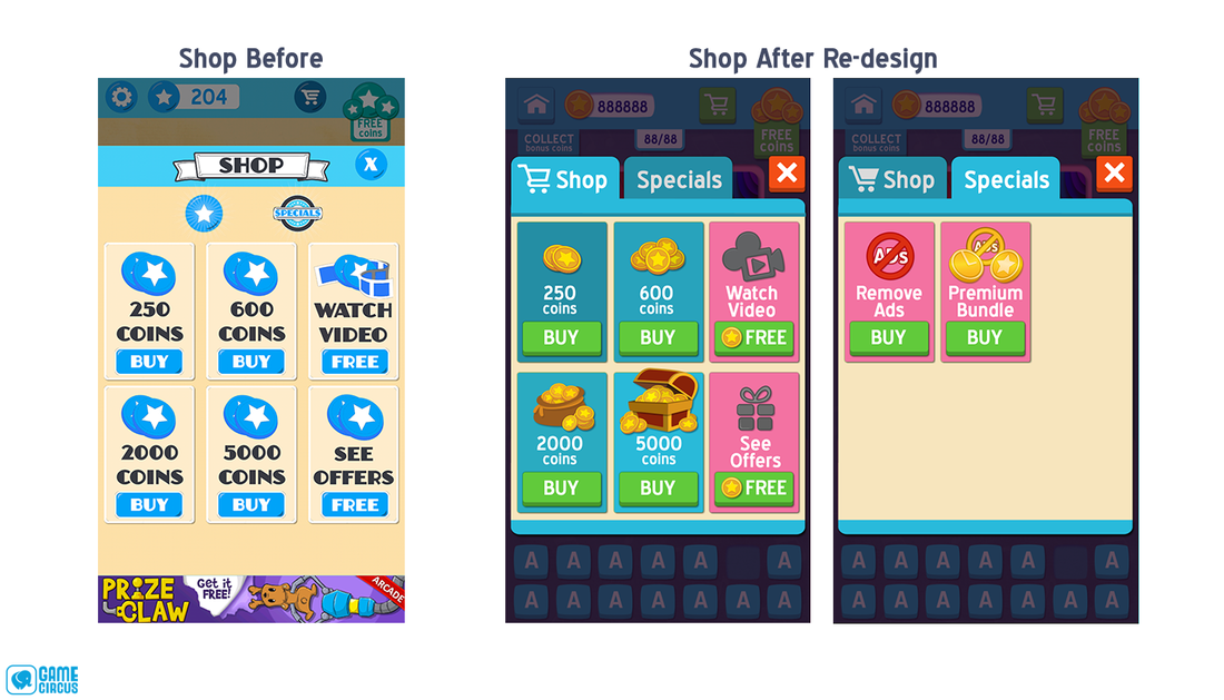
The biggest change in the Shop was the coin visual hierarchy. I used both scale and detail in creating more valuable visual purchases. Also giving a visual difference between the coin purchases and video offers helped avoid confusion at a quick glance.
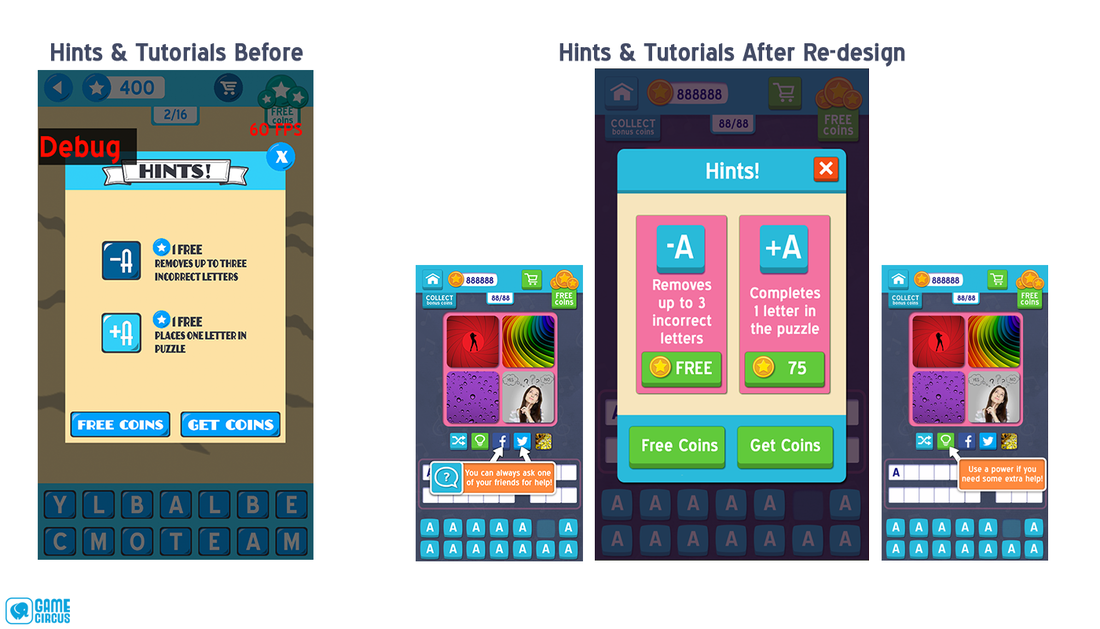
The biggest change to the Hints pop up was separating the purchases and making it clearer what the user needed to pay. Something I would change now about this screen is making the coin counter (how much the player has currently) more visible.
Other Features: Platinum Play