Clash Tactics: UI/UX Design
Only soft-launched outside of the US.
Role: Senior UI Artist
Skills: Creative Research, Concept, UI Design, Icon Design, UX, Layout, Wireframes, Style Guide Documentation, Storyboarding, Animatics, UI Animation, Communication
Tools: Adobe Illustrator, Photoshop, Unity Game Engine, NGUI plugin, Perforce
Skills: Creative Research, Concept, UI Design, Icon Design, UX, Layout, Wireframes, Style Guide Documentation, Storyboarding, Animatics, UI Animation, Communication
Tools: Adobe Illustrator, Photoshop, Unity Game Engine, NGUI plugin, Perforce
This was the first Mid-Core game I had the opportunity to design at Game Circus. Although the game was only soft-launched outside of the US, it was one of the most fun UI I designed.
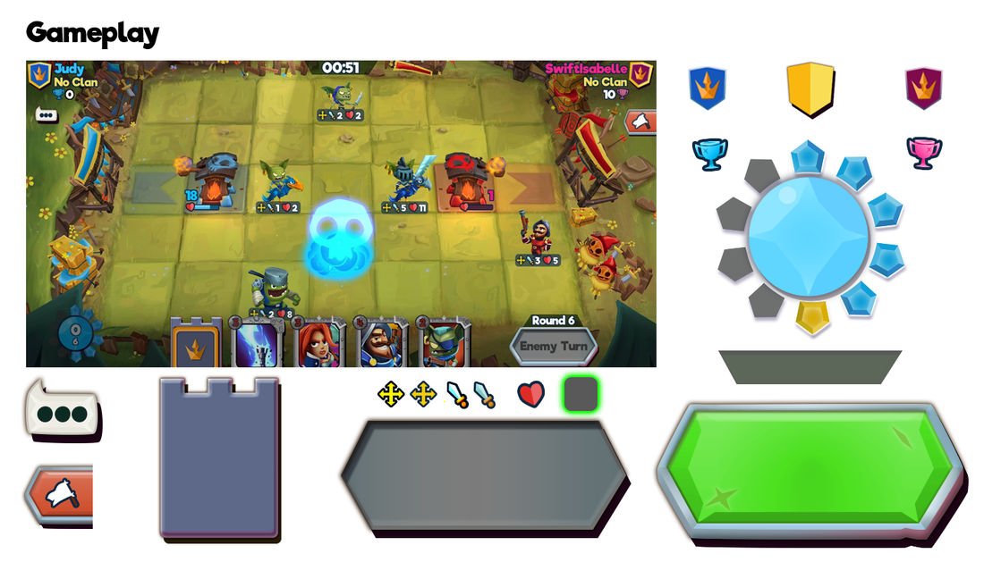
Gameplay
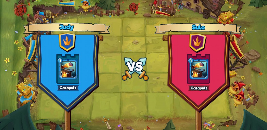
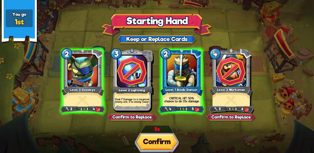
The most difficult UX decision for Gameplay was how much information to show to the player. We finally landed on the ability for the player to move, whether or not they could still attack, their attack power and health in an info widget under each character.
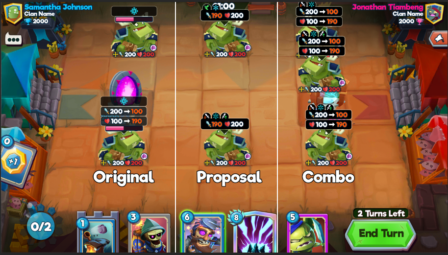
There were talks of further adding preview widgets and mock ups of those to show what players might need. Ultimately, it didn't make the cut for soft launch. The Original seen below was from the Game Designer perspective, the Proposal was from mine, and the last is a combination of the two. Each had pros and cons.
There were talks of further adding preview widgets and mock ups of those to show what players might need. Ultimately, it didn't make the cut for soft launch. The Original seen below was from the Game Designer perspective, the Proposal was from mine, and the last is a combination of the two. Each had pros and cons.
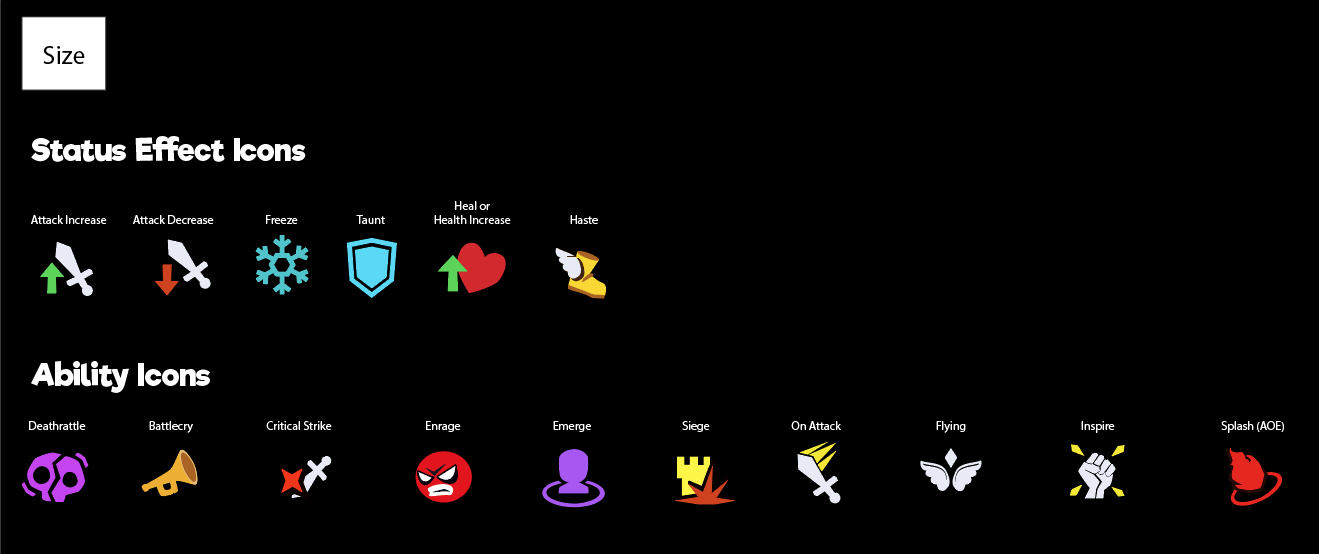
I also designed all the icons seen on the game board, including the ones you'd see when you looked at the expanded info on a card.
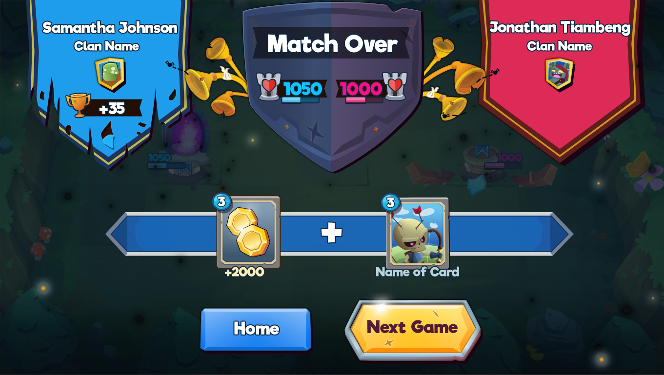
Gameplay: Intro
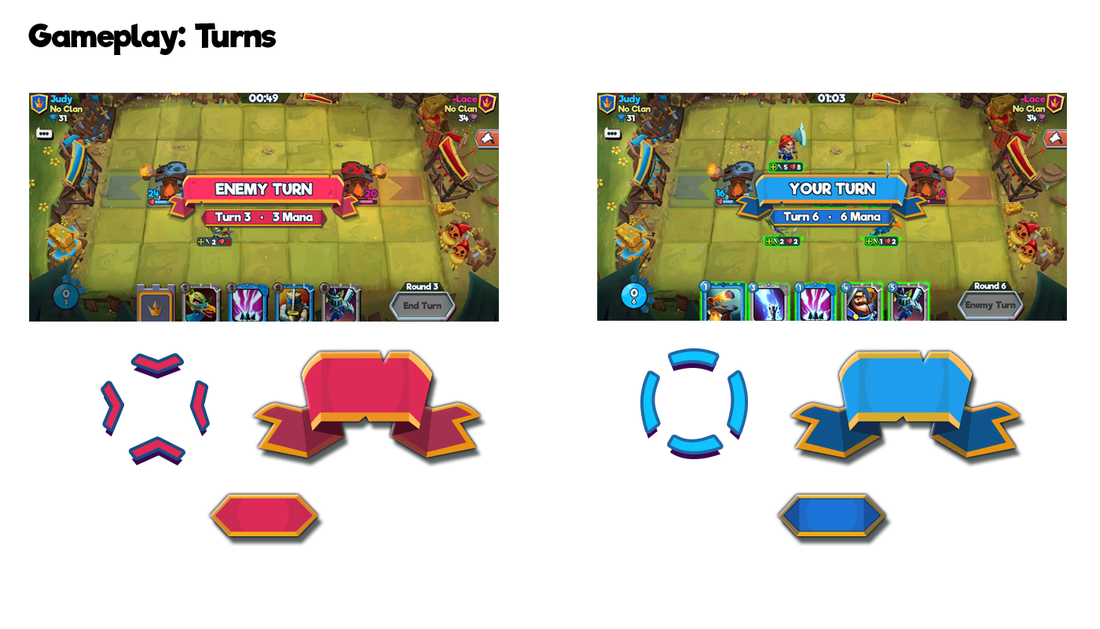
In addition to the UI, I also did the UI animation for the Mana Coin/Mulligan sequence in Unity. We borrowed heavily from Blizzard's Hearthstone.
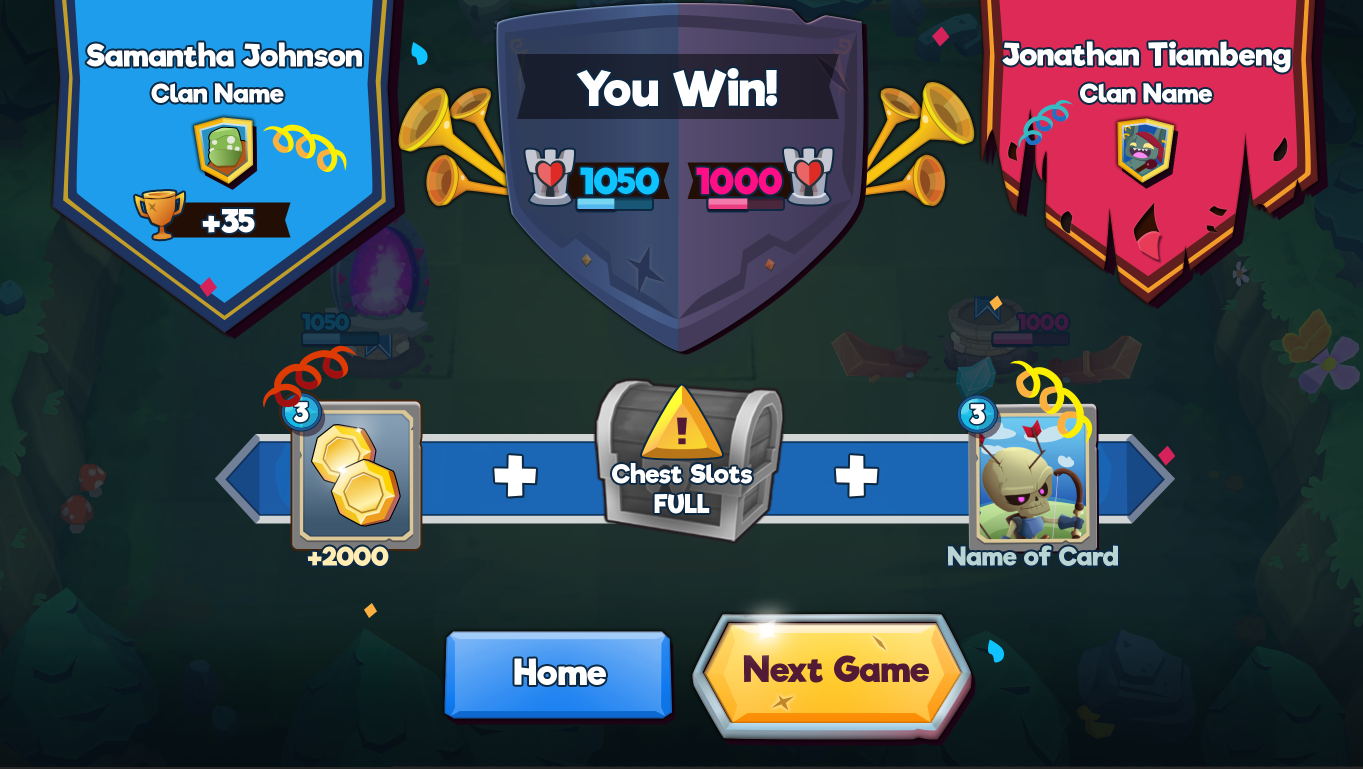
Gameplay Outro
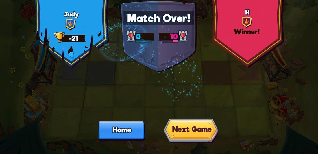
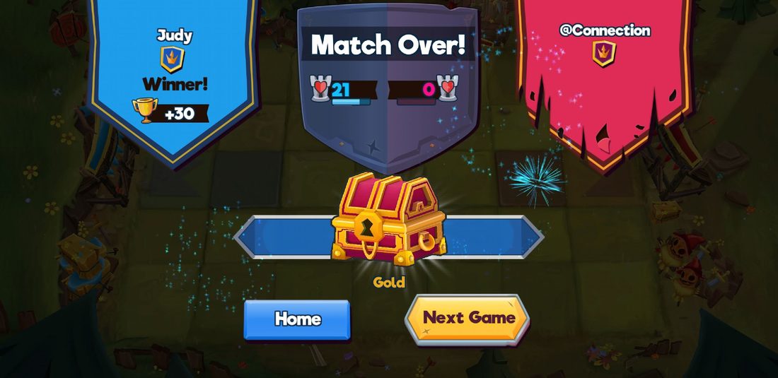
Unfortunately, due to time, we weren't able to implement all of the details from my mock up into the game. We went with the MVP you see in the in-game versions above.
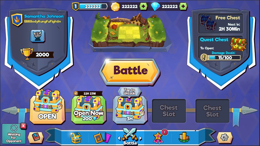
Home Page: Battle Screen
This was the first screen I mocked up to achieve the look and feel of the game. Above is a mock up before I updated the banners behind the shield.
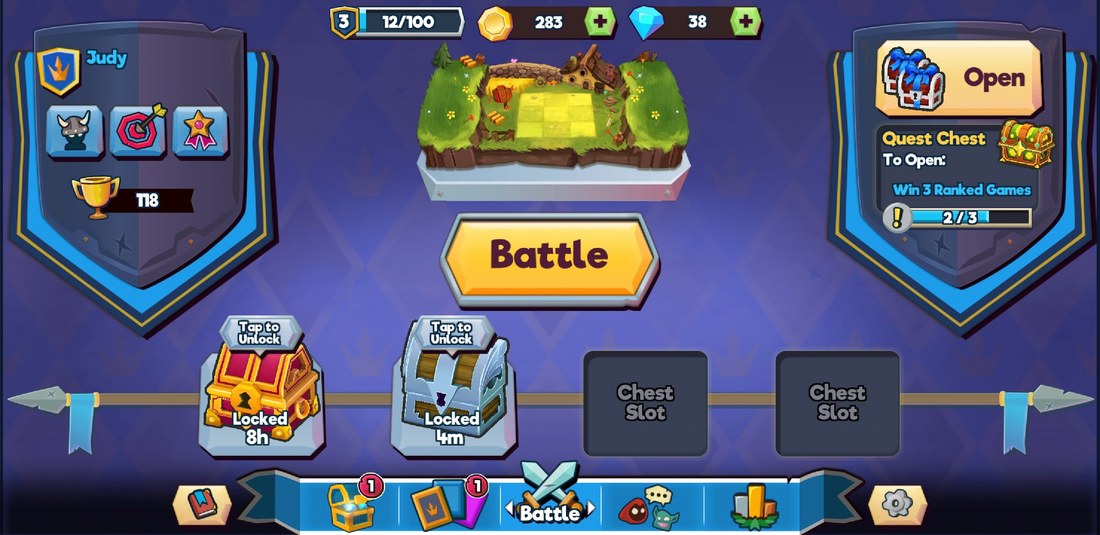
Below is the current in-game screen.
Below is the current in-game screen.
Popup Treatments: small, medium, large
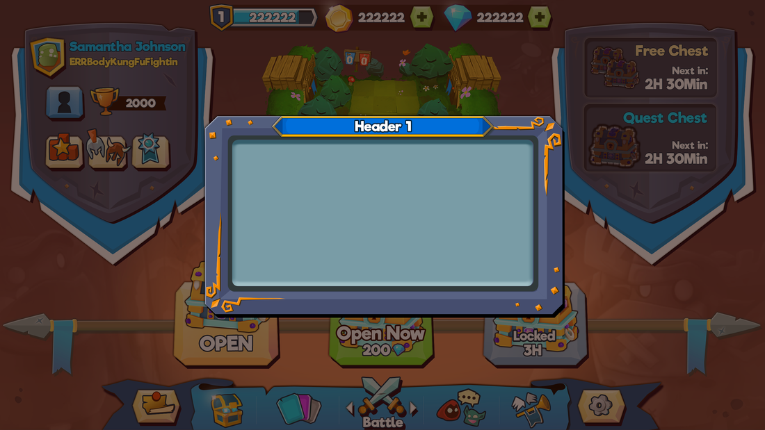
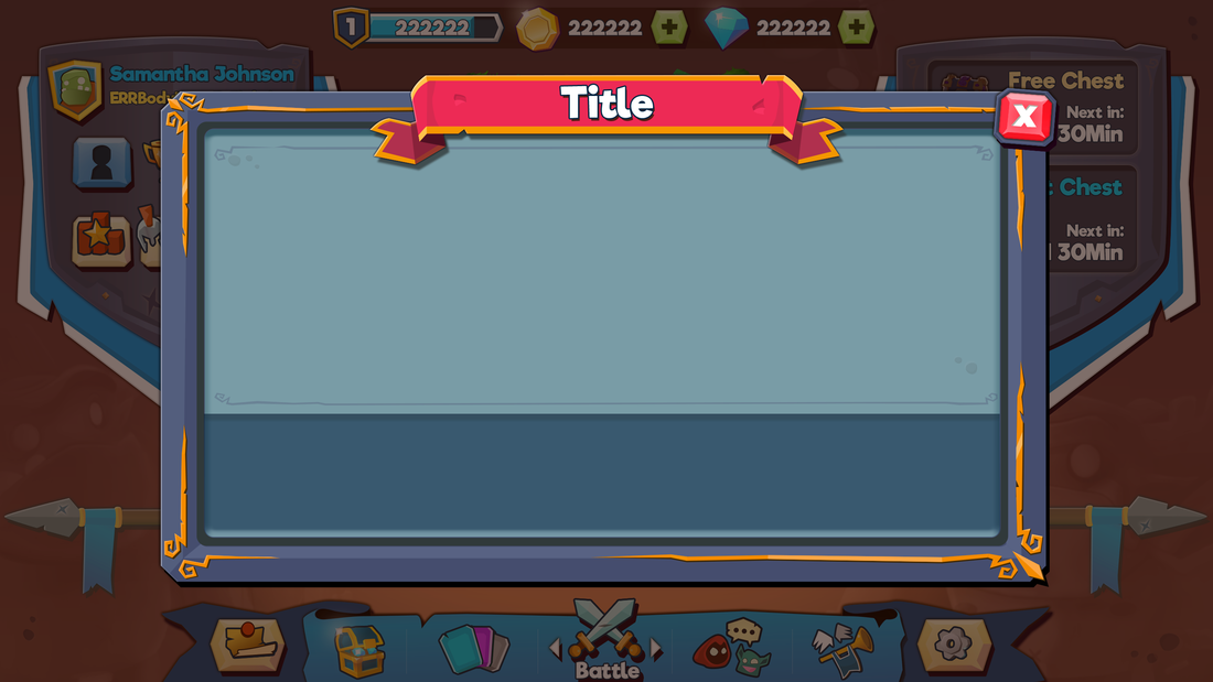
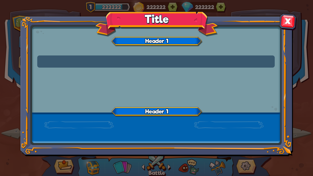
Developing a cohesive pop up treatment early in the concept phase helped guide the detail in some of the screens in the rest of the game.
Shop & Monetization
The most challenging part of the shop was to make it appealing, have a variety of buttons that showed either rarity or item type, and also optimize the assets so it didn't hurt load times. I originally used a gray scale button that I tinted in Unity to save texture space, but that added too many game objects which slowed down loading times. Overall the shop went through 5+ iterations before landing on what you see above.
The most fun was painting the wood paneling behind the main card items at the top.
The most fun was painting the wood paneling behind the main card items at the top.
Special Offers (mock ups):
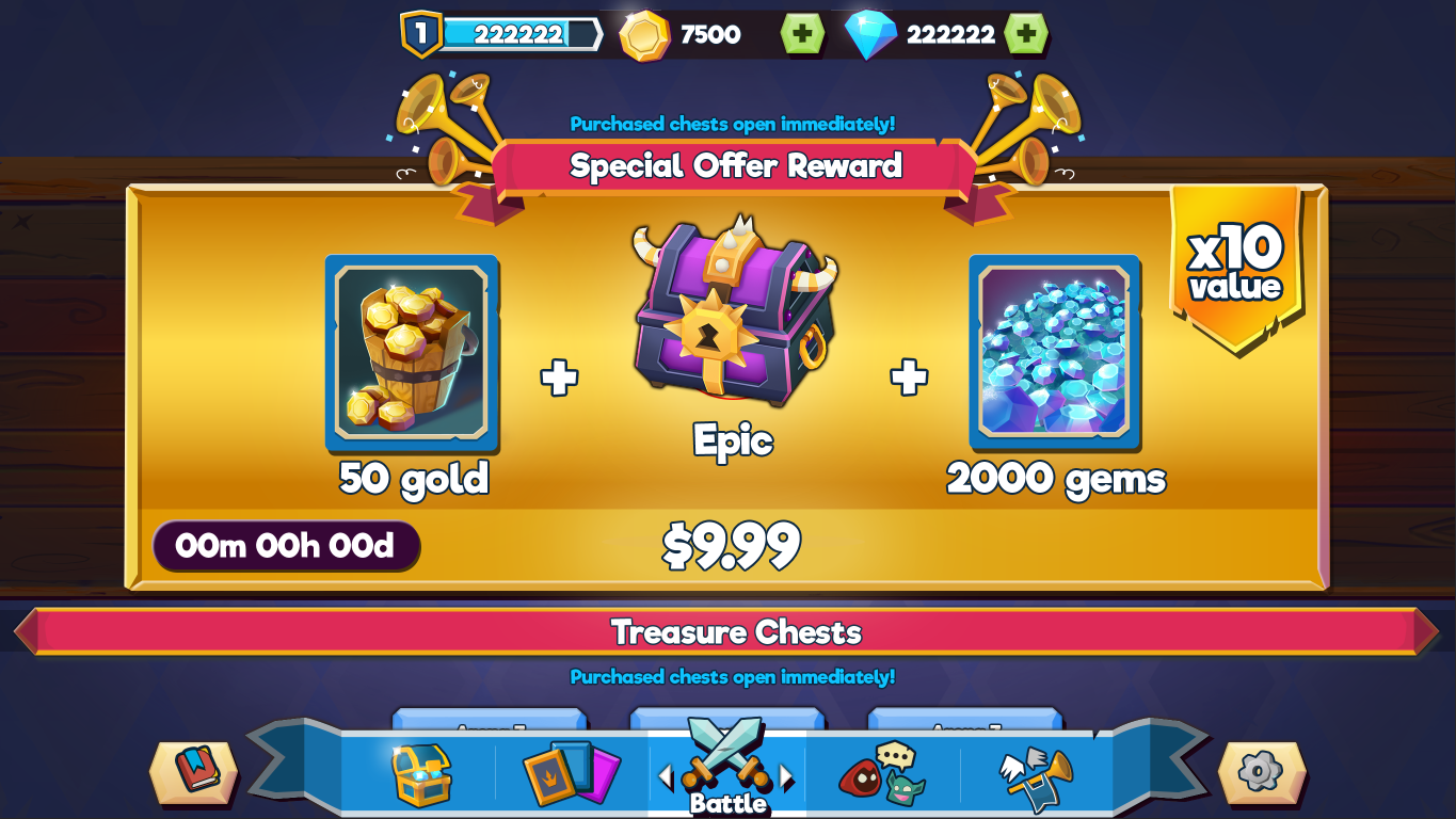
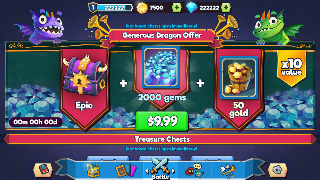
We tested these two special offer looks. The gold one was the Game Design proposed version and the dragon one was my proposed version. The dragons, offer items, and piles of gems were drawn by our concept artists; layout and other UI assets were created by me. The cards shown here are placeholders. Currently they're still running tests on which offer does better.
Gacha System: Cards
Cards are obtained through chests. The Collection screen shows the deck you use when you battle and the cards you have and can get in a vertical scroll. When you tap on a card, you see relevant information about the card as well as whether you can upgrade or use the card.
I worked with the Game Designers, Art Director, and Tech Leads on each of the screens. With rarity on the card designs, I worked with the Concept Artist and Art Director on how the cards needed to function and what kind of visual differences they'd need. I created a moodboard (shown in the last slide) to describe it. We eventually changed Legendary to a gold card as it showed more value.
I worked with the Game Designers, Art Director, and Tech Leads on each of the screens. With rarity on the card designs, I worked with the Concept Artist and Art Director on how the cards needed to function and what kind of visual differences they'd need. I created a moodboard (shown in the last slide) to describe it. We eventually changed Legendary to a gold card as it showed more value.
Clans
One of the biggest new features we did as a studio was Clans. We did a lot of wireframes and mock ups to get all the features we wanted on screen for easy access without it becoming too noisy.
Player Level Up
|
|
|
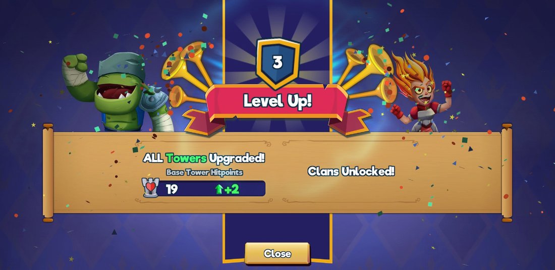
I created multiple animatics for this feature (shown 2 here) of what the level up sequence could be. We landed on the one on the right in the final game (characters in animatic are placeholders).
Chest Concepts
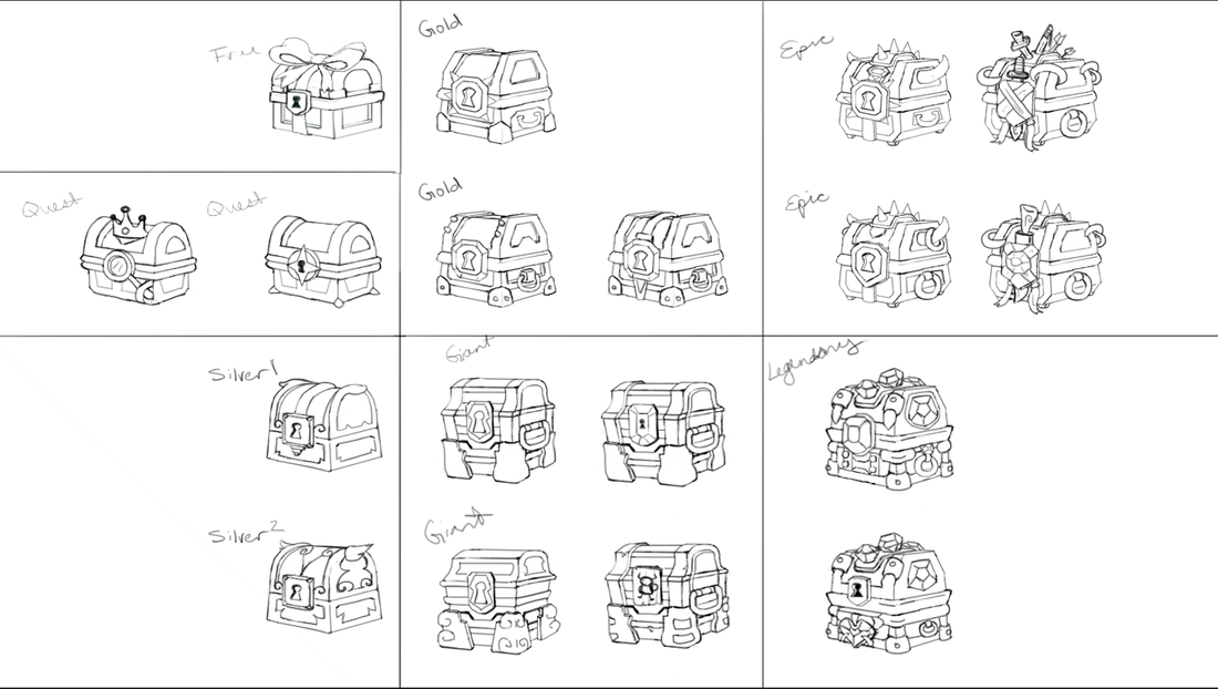
Before we finally hired another concept artist, I was doing the concepts for the chests. Some of my designs got made into the game as a 3D asset or inspired the final designs of the chests.

